What Should a Website Navigation Bar Include? In Website Design and Development
The 9 elements every website navigation bar needs, plus design and development best practices for SaaS, fintech and B2B sites. Checklist included.
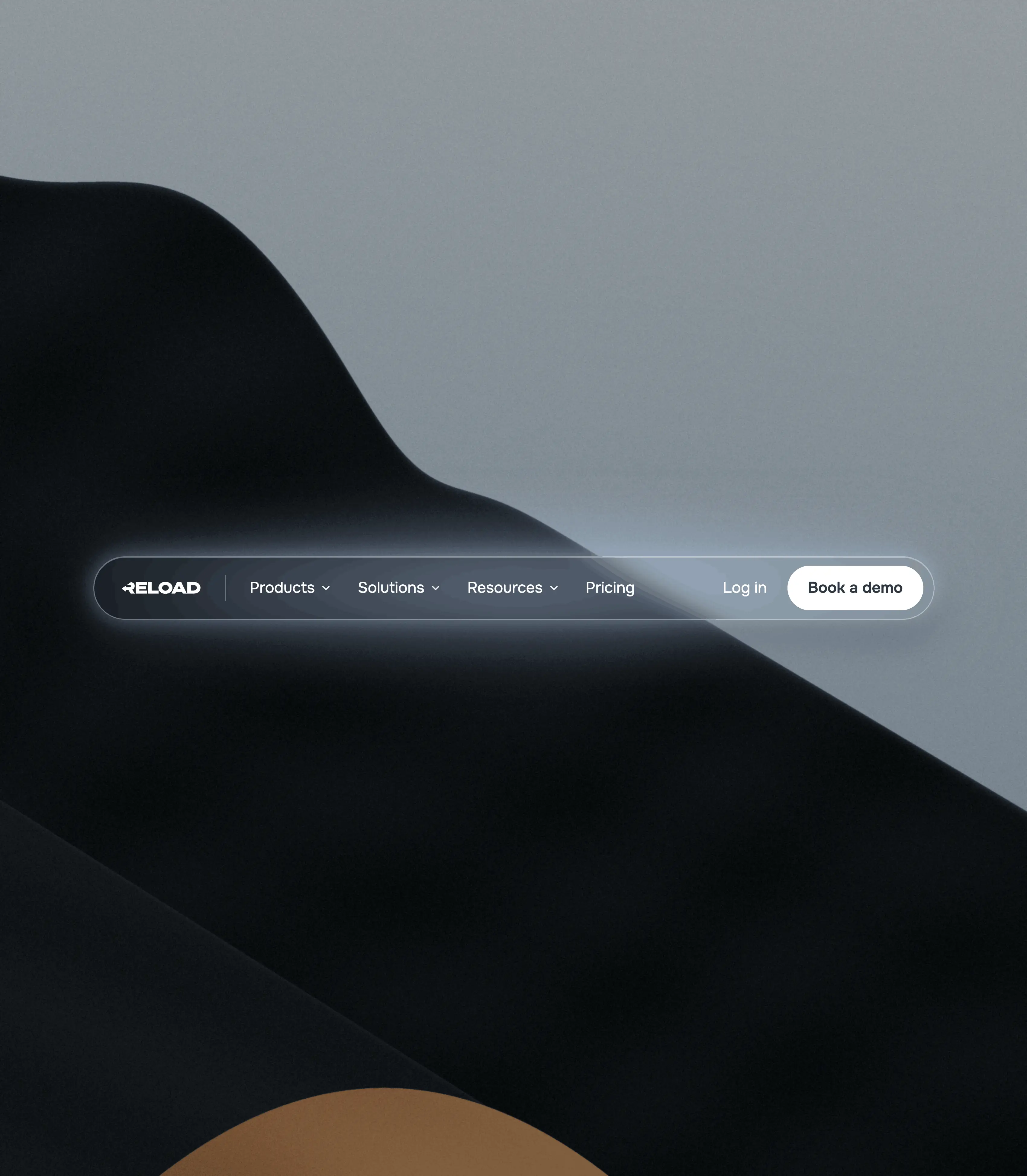


Short answer: a website navigation bar should include your logo (linked to the homepage), 4 to 7 clearly labelled main menu items, one primary call to action, a secondary action like Log in, and a mobile menu that works just as well as the desktop one. Depending on your site, you might also add search, a mega menu, a language switcher or an announcement bar. Everything else is usually noise.
The navigation bar is the one part of your website every visitor sees. It sits on every page, it's the first thing people scan, and it quietly decides whether they find your pricing, your product or your demo form, or whether they leave.
We've designed and built navigation for 200+ websites at Reload, mostly for SaaS, fintech and AI companies. The pattern is always the same: when the nav is clear, everything below it works harder. When it's cluttered, no amount of nice design on the page can save it.
In this guide we'll cover exactly what to include, what to leave out, and how to design and build a nav bar that helps your marketing team instead of getting in its way.
What is a website navigation bar?
A website navigation bar (or navbar) is the horizontal menu at the top of a website. It shows the main sections of the site and gives visitors a consistent way to move between them from any page.
It's the most visible piece of your information architecture. The navbar tells people, in a few words, what you offer and where to find it. It also tells search engines and AI systems which pages matter most, because the links in your nav appear on every page of the site.
A good navigation bar does three jobs at once:
- Orientation: shows visitors where they are and what's available
- Direction: gets them to the page they came for in one or two clicks
- Conversion: keeps your main action (Book a demo, Start free trial) always in reach
What should a website navigation bar include? The 6 essentials
These are the elements every navbar needs, whether you run a 5-page startup site or a 200-page enterprise one.
1. Your logo, linked to the homepage
The logo goes on the left (in left-to-right languages). It anchors your brand on every page, and clicking it should always take people home. Visitors expect this so strongly that leaving it unlinked feels broken.
Keep it compact. A logo that pushes the nav to two lines on a laptop screen is too big. Use a simplified logo variant if your full lockup is wide.
2. 4 to 7 main menu items
This is where most websites go wrong. Every team wants their page in the nav, and suddenly there are 11 links fighting for attention.
Keep the top level to roughly 4 to 7 items. Fewer choices mean faster decisions. For most B2B and SaaS websites, a structure like this works:
- Product (or Platform, or Solutions)
- Use cases or Industries
- Pricing
- Customers
- Resources (blog, guides, docs)
- Company (about, careers, contact)
Order matters too. People pay most attention to the first and last items, so put your most important pages there. Pricing is one of the most visited pages on any SaaS site, so don't hide it inside a dropdown.
3. Clear, plain-language labels
Labels should describe what's on the page, not show off your brand voice. "Pricing" beats "Plans & Possibilities". "Customers" beats "Wall of Love".
Think of each label as a promise. If someone clicks "Integrations" and lands on a vague features page, you've broken that promise. Clear labels also help SEO and AEO, because your nav links act as descriptive anchor text on every page.
4. One primary call to action
Your main CTA belongs on the far right, styled as a button. "Book a demo", "Start free trial" or "Get started". Pick one.
This is the single highest-value spot on your website. It's visible on every page, at every scroll position if your nav is sticky. Two competing primary buttons split attention and usually lower your conversion rate.
5. A secondary action (when you have one)
If you have a product with logins, add "Log in" or "Sign in" next to the primary CTA, styled as a text link or outline button. Existing customers use this every day, and making them hunt for it creates support tickets.
Other common secondary actions are "Contact sales" or "Talk to us" next to a "Start free trial" button.
6. A mobile menu that actually works
On mobile, the nav collapses into a menu icon (the hamburger). This is where many websites get lazy: dropdowns that don't open, tiny tap targets, or a CTA that disappears entirely.
A good mobile menu:
- Keeps the primary CTA visible, either in the header bar or at the top of the open menu
- Uses tap targets of at least 44 x 44 px
- Opens dropdowns as accordions, not hover menus (there's no hover on a phone)
- Locks page scroll while the menu is open
- Has an obvious close button
A lot of B2B traffic starts on a phone, often from a LinkedIn post or an email link. Design the mobile-first version with the same care as desktop.
Optional navbar elements (and when to use them)
The essentials work for every website. These extras depend on how big your site is and who visits it.
For SaaS websites
Pricing and Log in are non-negotiable. A Product dropdown with features and integrations, plus a Resources dropdown for the blog and docs, covers most cases. If you sell to several roles, add a Solutions menu split by team or use case.
For fintech websites
Trust does a lot of the work here. Make Security or Compliance easy to reach, either as its own item or inside the Product menu. Many fintech companies serve both businesses and consumers, so a clear split ("For business", "For individuals") saves visitors from the wrong funnel.
For enterprise and multi-product companies
This is where a well-structured mega menu earns its place. Group links by how buyers think (by product, by industry, by team), add one short line under each link, and feature a case study or new release in one panel. Keep the top level just as short as a startup's would be. The depth belongs in the dropdown, not the bar.
Fintech navigation examples: what the best companies do
Theory is useful, but the clearest lesson comes from looking at real navbars. We picked four fintech companies with very different products and audiences. Their navigation is almost identical in structure.
Stripe
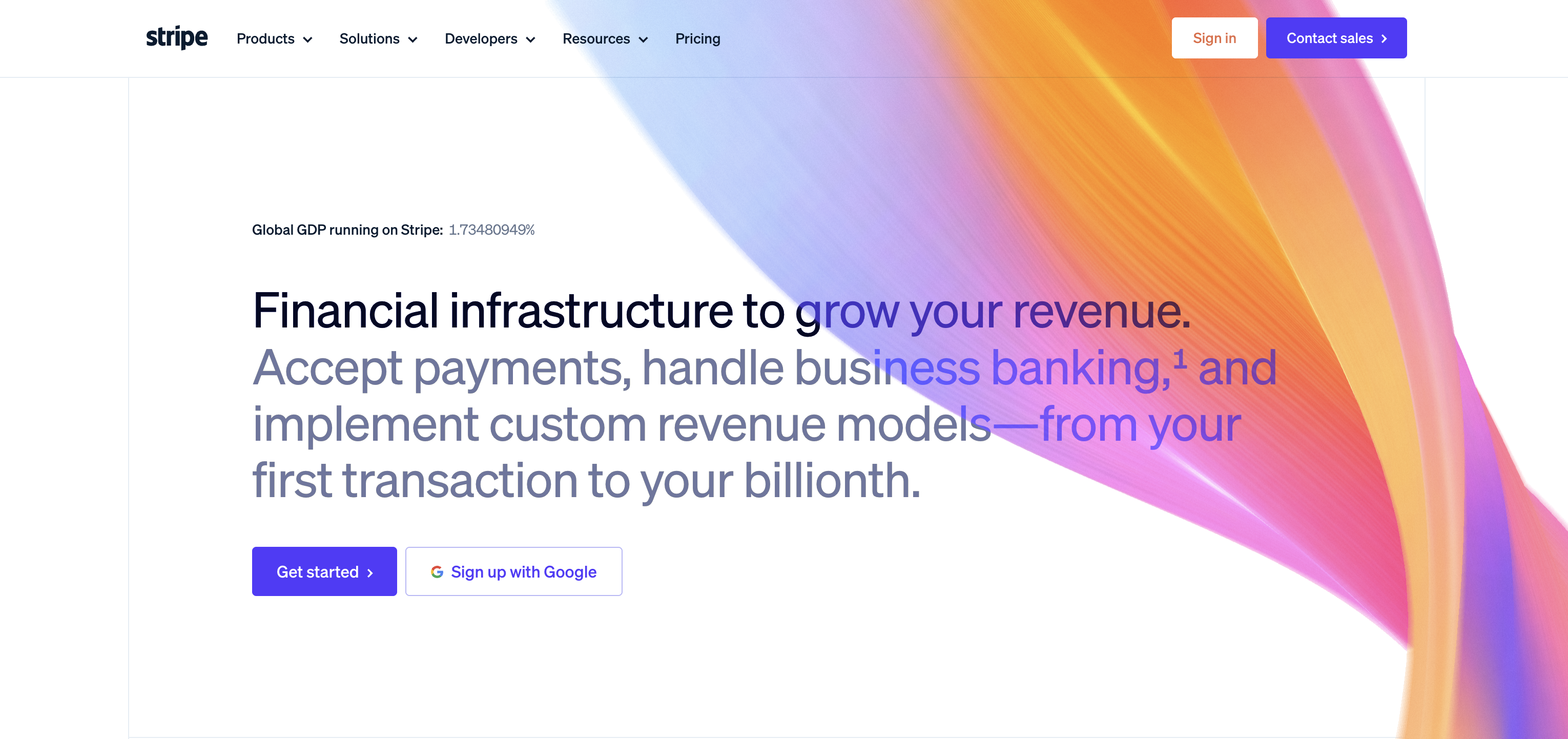
Five top-level items: Products, Solutions, Developers, Resources and Pricing. Everything with depth sits in a dropdown, and Pricing is a single direct link. On the right, "Sign in" is a quiet secondary action and "Contact sales" is the only filled button. The Developers menu is the one item that's specific to Stripe, because developers are a core audience.
Mercury
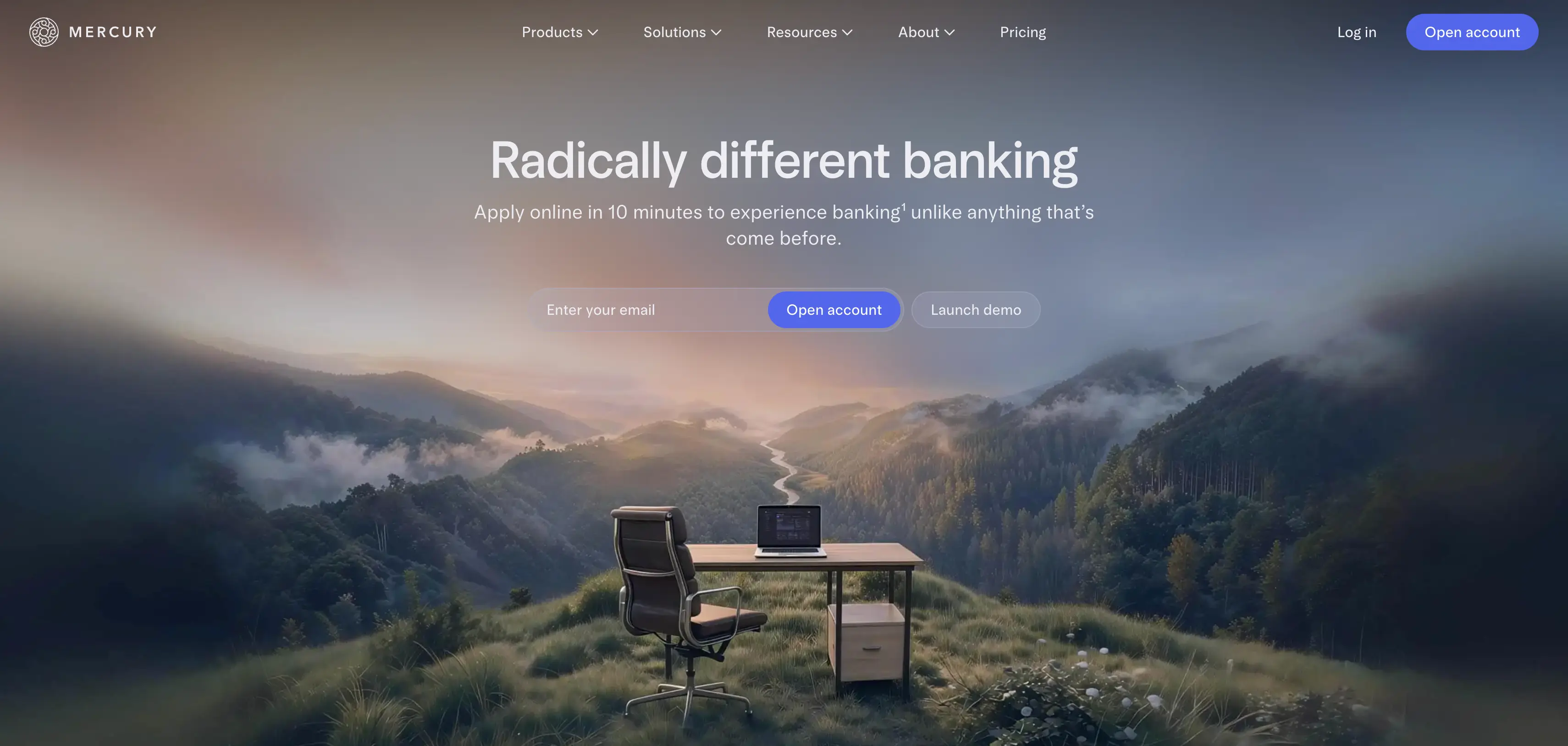
Again five items: Products, Solutions, Resources, About and Pricing. "Log in" is plain text, "Open account" is the one button. The nav repeats the hero's main action, so the visitor sees the same next step twice. Note how much empty space there is. Mercury trusts a short nav to do the job.
Zip
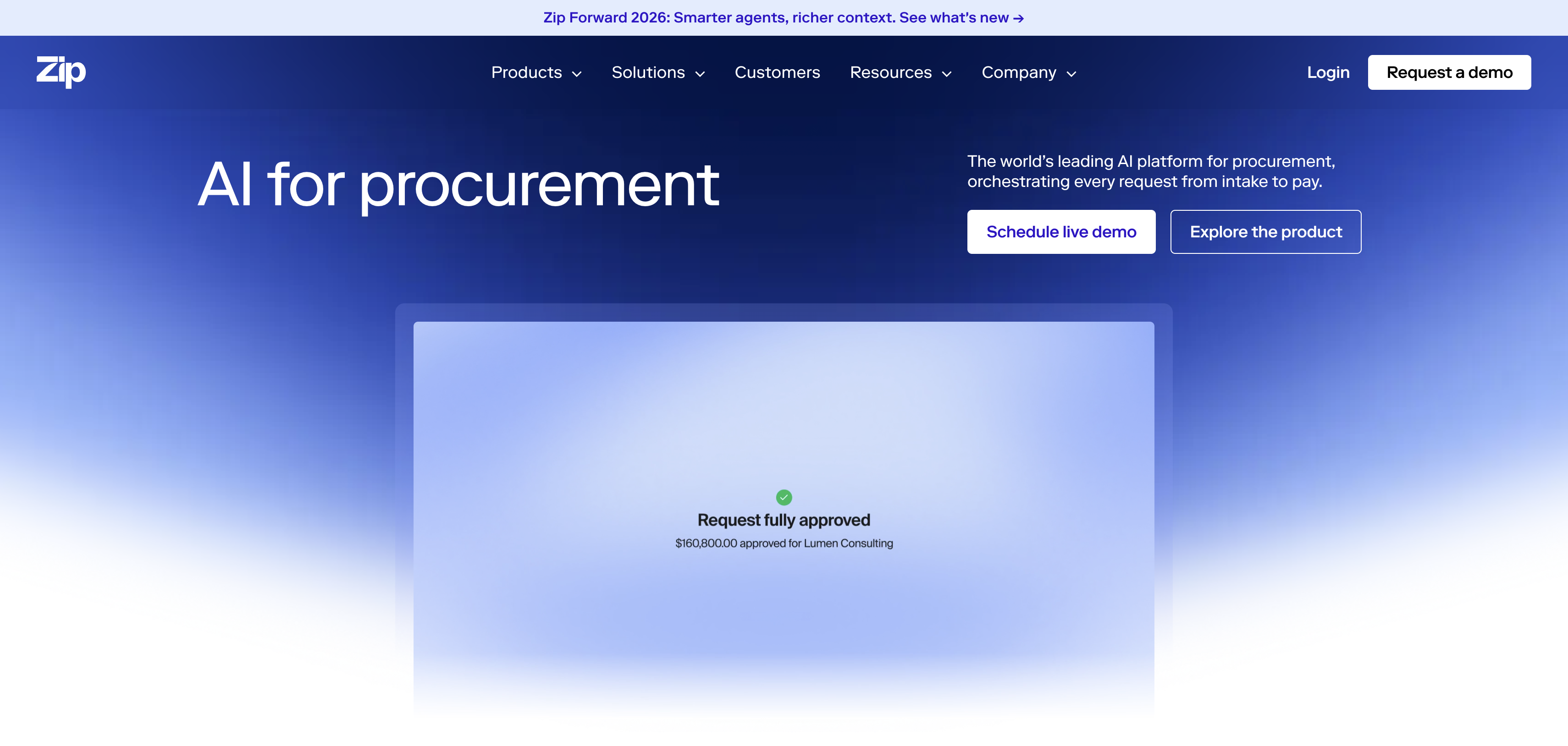
Five items: Products, Solutions, Customers, Resources and Company. There's no Pricing link, and the CTA is "Request a demo". Customers gets its own top-level spot, which makes sense for an enterprise product where proof from similar companies sells. The announcement bar above the nav promotes a product launch without touching the menu itself.
Checkout.com
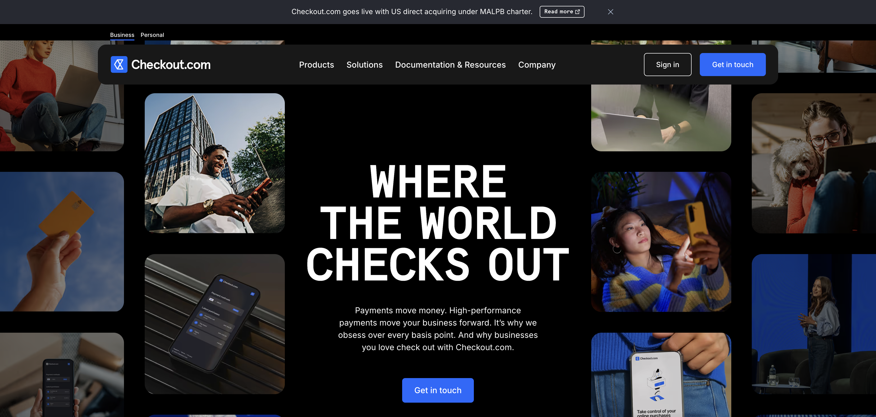
Just four items: Products, Solutions, Documentation & Resources and Company. "Sign in" is outlined, "Get in touch" is filled. Like Zip, there's no Pricing link and an announcement bar sits on top. Checkout.com also adds a small Business / Personal switch above the nav, which splits two audiences before they ever open a menu.
The pattern
Three things stand out:
- Products, Solutions and Resources appear on all four. Products answers "what do you sell", Solutions answers "is it for someone like me", and Resources holds everything else.
- None of them has more than 5 top-level items. These are big companies with hundreds of pages. The depth lives in the dropdowns.
- Pricing depends on how you sell. Stripe and Mercury let you sign up and start on your own, so they show Pricing. Zip and Checkout.com sell through a sales team with custom quotes, so they leave it out and lead with a demo or contact button. Your nav should reflect your sales motion, not a template.
What crowded navigation looks like
Bank of America
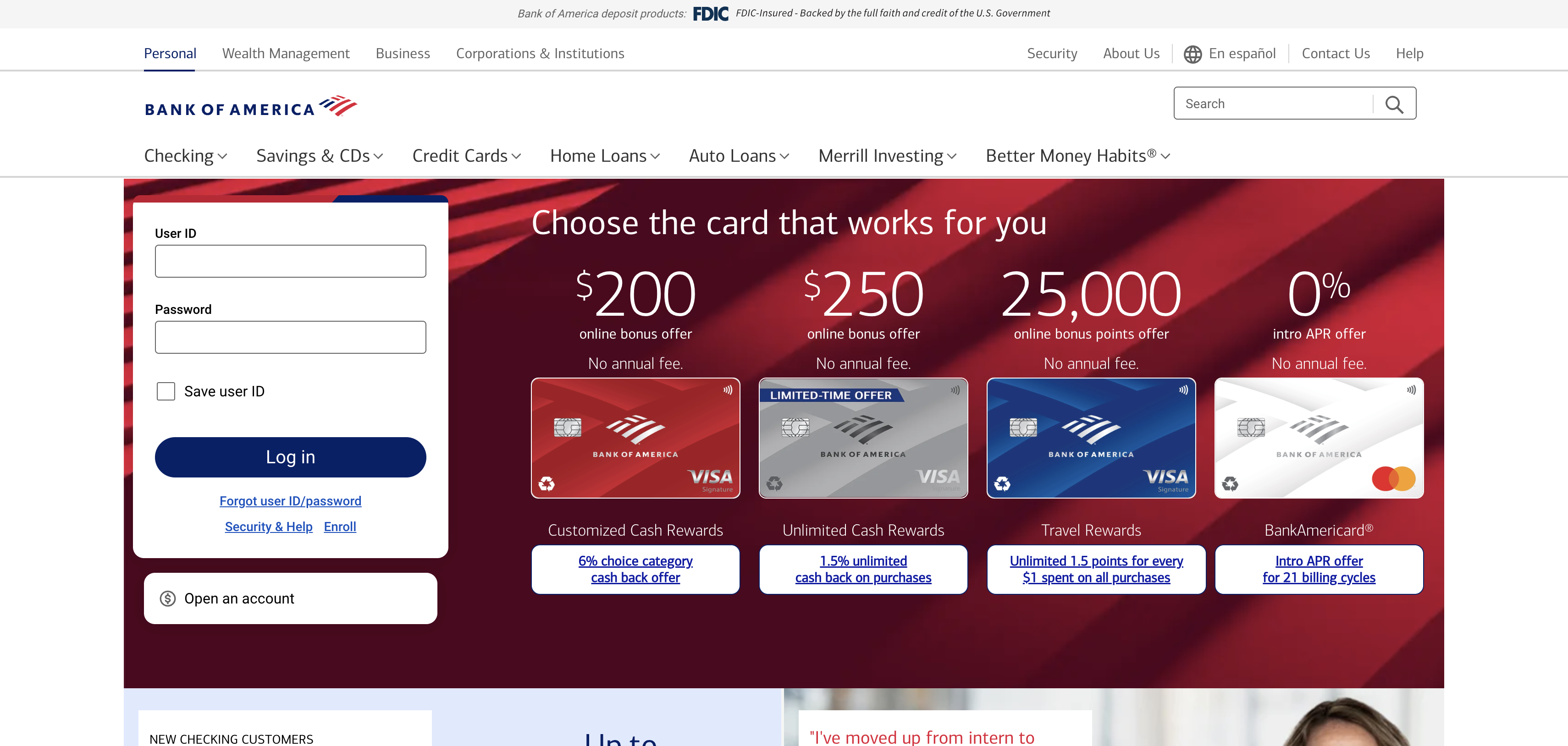
Count the links before the page even starts: 4 audience tabs (Personal, Wealth Management, Business, Corporations & Institutions), 5 utility links (Security, About Us, En español, Contact Us, Help), a search bar, and 7 product menus. That's 16 navigation items across three rows, plus a regulatory banner on top.
There's also no single primary action. The login form sits in the hero, "Open an account" sits below it, and four credit card offers compete beside both.
To be fair, Bank of America serves millions of very different customers, and the FDIC line is a regulatory requirement. But that's exactly the point. This navigation is built around the bank's org chart and product catalogue, not around what one visitor came to do. If you're a SaaS or fintech company copying the "big bank" look to seem trustworthy, copy the clarity of Stripe instead.
Navigation bar design best practices
What goes in the nav is half the job. How it looks and behaves is the other half.
Follow the convention. Logo left, links in the middle or next to the logo, CTA right. Visitors have seen this layout thousands of times. Creative navigation (hidden menus on desktop, vertical side navs, floating circles) makes people think, and thinking is friction.
Build a clear visual hierarchy. The CTA button should be the strongest element in the bar. Menu links come second, secondary actions third. If everything is bold, nothing stands out.
Show where people are. Highlight the current section with a subtle underline, colour or weight change. It helps orientation, especially on deeper pages.
Keep it light. A nav height of roughly 64 to 80 px on desktop works for most sites. On scroll, a sticky nav can shrink slightly and add a soft background so it stays readable over content.
Design dropdowns for scanning. Group links under short headings, add one line of description where labels alone aren't clear, and use icons only if they genuinely help recognition. A dropdown is not the place for paragraphs.
Keep interactions subtle. Dropdowns should open fast (around 150 to 250 ms) and stay open while the cursor moves into them. Hover effects should be consistent across every link. Big animations in the nav get annoying on the second page view.
Check contrast everywhere. A transparent nav over a dark hero image often becomes unreadable over a white section further down. Test it on every page template, not just the homepage.
Navigation bar development best practices
A navbar can look perfect in Figma and still fail in the browser. These are the things we check on every build.
Accessibility
- Wrap the menu in a
<nav>element with a clear label (e.g. aria-label="Main") - Make every link and dropdown reachable and usable with the keyboard alone (Tab, Enter, Esc)
- Use aria-expanded on dropdown and menu toggles so screen readers know their state
- Show a visible focus state, never remove outlines without a replacement
- Add a "Skip to content" link so keyboard users don't tab through the whole nav on every page
- Meet WCAG contrast requirements for links and the CTA
Accessibility isn't a nice extra. For enterprise and fintech buyers it's often part of procurement, and it's good accessibility (a11y) practice for everyone else.
Performance
The nav loads on every page, so any weight it carries is multiplied across the whole site.
- Use SVG for the logo and icons
- Avoid heavy scripts or third-party widgets inside the nav
- Reserve the nav's height in CSS so it doesn't push content down while loading, which hurts CLS and your Core Web Vitals
- Keep mega menu images small, lazy loaded and in WebP or AVIF
SEO and AEO
Navigation links are some of the strongest internal links on your site, because they appear on every page. Use them for the pages you want to rank and the pages you want AI assistants to understand: product, pricing, use cases, key resources.
Use real <a href> links, not buttons with JavaScript click handlers, so crawlers can follow them. And keep the menu in the HTML on load, rather than injecting it with a script after the page renders.
Building navbars in Webflow
- Build the nav as one component, so a change updates every page at once
- Use Webflow's native Navbar and Dropdown elements, which handle keyboard and ARIA basics out of the box
- Use component properties for variants like a transparent hero version or a dark version
- Set your mobile breakpoint behaviour deliberately; the default collapse point isn't always right for your number of links
- For mega menus, keep the structure clean with consistent class naming so the marketing team can edit links without breaking the layout
That last point matters more than people think. The best navbar is one your marketing team can update on a Friday afternoon without calling a developer.
7 navigation bar mistakes we see all the time
When we audit websites, the nav is almost always on the list. These come up most often:
- The org chart nav. The menu mirrors internal departments instead of what visitors are looking for. Buyers don't care how your company is structured.
- Too many top-level items. Ten or more links, often added one at a time by different teams over a couple of years.
- Clever labels. Brand-voice names that make people guess what's behind them.
- Hidden pricing. Buried in a dropdown, or missing completely. Visitors who want to know the price will find it on a competitor's site instead.
- Two competing CTAs. "Book a demo" and "Start free trial" side by side as equal buttons, so neither gets clicked as often as one would.
- A broken mobile menu. Hover-only dropdowns, a CTA that disappears, or a menu that scrolls the page behind it.
- A nav nobody can edit. Hardcoded links copied onto every page, so changing one label means a developer ticket and a week of waiting.
Website navigation bar checklist
Run through this before you launch or redesign:
- Logo on the left, linked to the homepage
- 4 to 7 top-level items, ordered by importance
- Plain-language labels that match the page they lead to
- Pricing visible at the top level (if you publish pricing)
- One primary CTA button on the right
- Log in or a secondary action, styled clearly weaker than the CTA
- Mobile menu with a visible CTA and tap targets of 44 px or more
- Dropdowns usable by keyboard and screen reader
- Current page or section highlighted
- Readable on every page template and background
- Built as one reusable component your team can edit
FAQ
What should a website navigation bar include? At minimum: a logo linked to the homepage, 4 to 7 main menu items with clear labels, one primary call to action, a login or secondary action if you need one, and a working mobile menu.
How many items should be in a navigation bar? Aim for 4 to 7 top-level items. If you need more, group related pages into dropdowns or a mega menu rather than adding more links to the bar.
Should the navigation bar be sticky? For most marketing websites, yes. A sticky nav keeps your CTA in reach on long pages. On mobile, keep the sticky bar slim so it doesn't take up too much of the screen.
Where should the CTA go in a navbar? On the far right, styled as a button. It should be the most visually prominent element in the navigation.
Is a mega menu good for SEO? It can be. A mega menu adds strong internal links to important pages across the whole site. Keep it focused on pages that matter, though, because linking to dozens of minor pages dilutes that value and overwhelms visitors.
What is the difference between a navbar and a header? The header is the whole top area of the page. The navbar is the menu inside it. On most modern websites, the header contains the logo, the navbar and the CTA in a single bar.

Share this story on:
Popular Blogs